Case Study · Concept Product · Civic Services

Civis

A citizen-first services portal — one place for appointments, payments, and proof. Designed to reduce uncertainty and make the next step obvious.

Time-to-action ↓
Fewer steps to the right next move
Confidence ↑
“I’m sure this is correct” after submit
Errors ↓
Less wrong-path clicking and re-checking
Proof retrieval ↑
Receipts + IDs in seconds, not minutes
CIVIS concept — calm, official, action-ready dashboard
Calm, official, action-ready — clear status, clear next step, proof always close.
My role
Product Design (UX/UI)
IA, content design, core patterns, states, and component rules
I focused on
Status → Action → Proof
Status-first layouts, proof surfaces, scannable content structure
Outcome intent
Reduce uncertainty
Less backtracking, faster completion, higher confidence

Context

The problem

Civic services aren’t hard because tasks are complex — they’re hard because the experience is fragmented. Multiple sites, unclear statuses, proof scattered across emails and PDFs.

Cause
Fragmentation
Longer time-to-action — users click around, second-guess, abandon.
Cause
Status anxiety
Repeated checking loops — “did it go through?” drives return visits.
Cause
Proof scattered
Support burden rises — “where is my receipt?” becomes a recurring ticket.

Impact

KPIs & target outcomes

Designed with measurable intent — so the UX can be validated, not just admired.
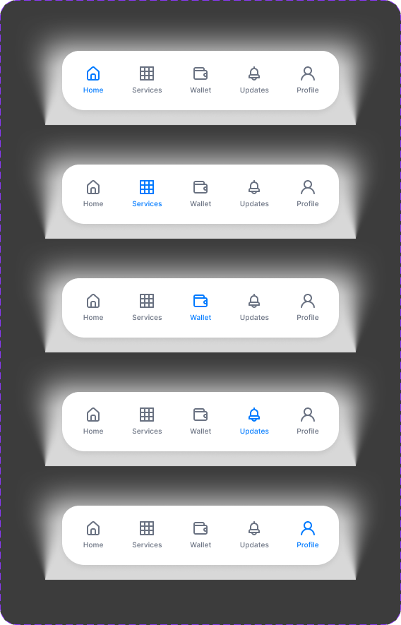
Time-to-action
↓ Steps
Fewer steps to the correct next action from Home / Services
Confidence
↑ Certainty
Higher “I’m sure this is correct” after submit / pay / book
Error reduction
↓ Wrong paths
Less wrong-path clicking and repeated checking loops
Proof retrieval
↑ Speed
Receipts + reference IDs findable in seconds, not minutes

Structure

Information architecture

Four stable areas that match how people think. The pattern behind every screen: Status → Next action → Proof.

01
Home
What needs attention + what’s next
02
Services
Entry points with requirements + timelines
03
Wallet
Payments, receipts, reference IDs
04
Updates
Action-driven notifications

Principles

What guided every screen
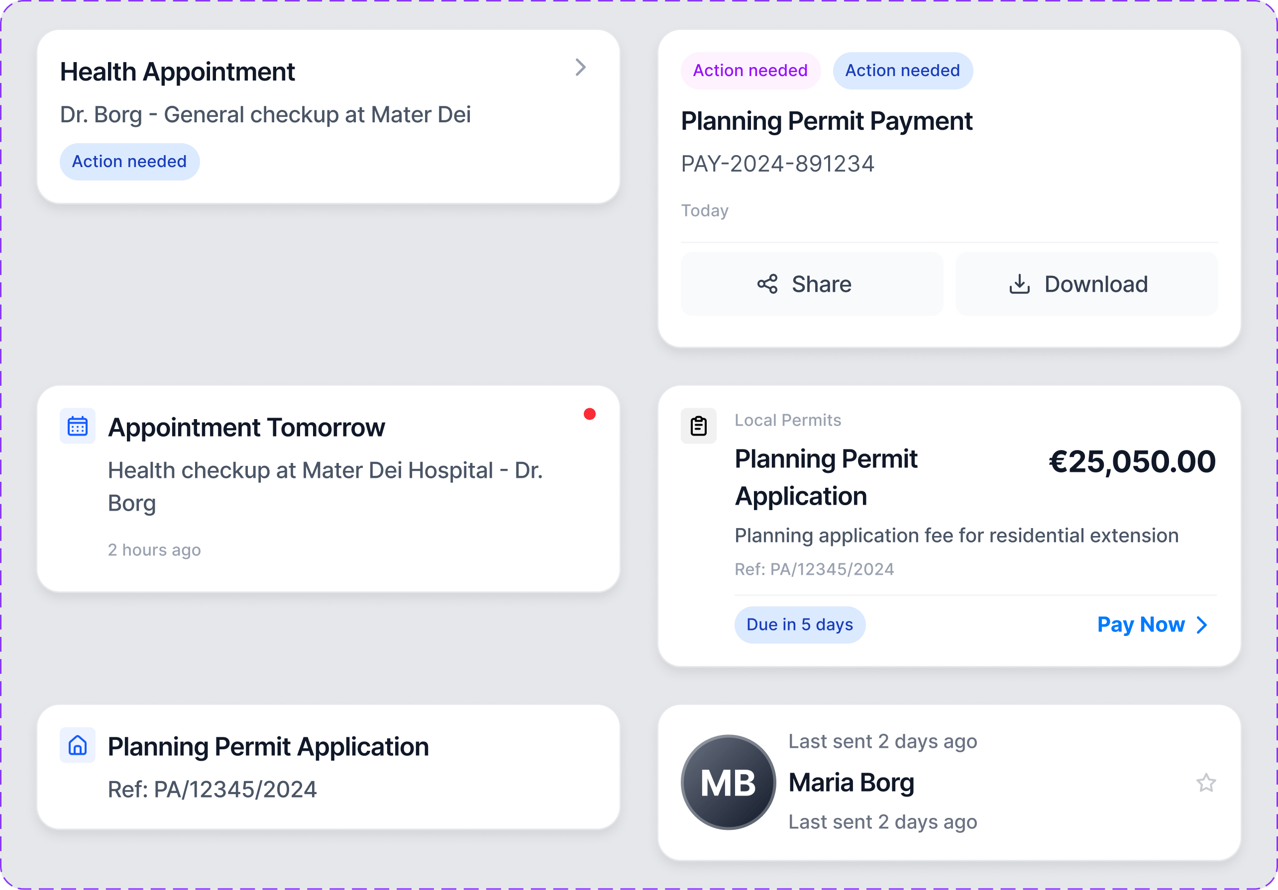
Principle
Clarity over density
Fewer choices, stronger hierarchy — reduce cognitive load at every step.
Principle
Status is visible
Users always know where they stand — no guessing, no re-checking.
Principle
Proof is first-class
Receipts and IDs are designed into the UI, not buried in email.
Principle
Consistency scales
Patterns repeat so users don’t re-learn — services feel like the same product.

Screens

Key screens

Same hierarchy, same interaction rules — the experience stays calm because layout and action priority behave consistently.
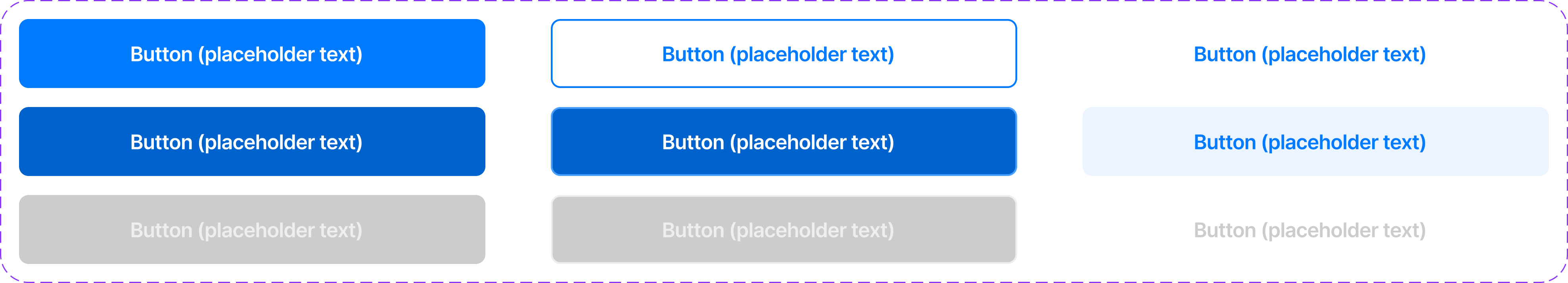
Services — structured entry points with requirements and timelines
Services — requirements + timeline + the single best next step.
Wallet — payments and proof in one place
Wallet — payments + proof in one place. Receipts findable in seconds.
Updates — action-driven, not noisy
Updates — what changed, what it means, what to do next.
High-stakes flows — healthcare readiness
High-stakes flows — when stress is high, clarity must get stronger without getting louder.

Components

Visual system

Each component exists to support the KPIs — quicker decisions, fewer errors, faster proof retrieval.

Service Card component
Service Card — title, status, requirements, primary action. Built to reduce wrong-path clicks.
Button hierarchy component
Button hierarchy — consistent primary/secondary actions reduce decision friction.
Navigation model
Navigation — four stable areas reinforce the mental model.

Process

Exploration & refinement

Refining hierarchy, states, and content density — without losing the calm tone or breaking consistency.

Hierarchy exploration
Hierarchy exploration — testing scan paths, readability, and spacing.
Density tuning
Density tuning — balancing information without making the UI busy.
Pattern rhythm
Pattern rhythm — repeated patterns feel familiar, reduce cognitive load.
State handling
State handling — empty/loaded states that keep “what next?” clear.
Form clarity
Form clarity — labels, hints, and validation patterns to reduce errors.
Status surfaces
Status surfaces — making state visible prevents repeat checking loops.
Content structure
Content structure — information broken into scannable chunks.
Confirmation patterns
Confirmation — clear confirmations reduce anxiety, especially for payments.
Steps and progress
Steps + progress — keeping users oriented in multi-step tasks.
Action hierarchy
Action hierarchy — primary action stays obvious even on busy screens.
Accessibility readiness
Accessibility — contrast and spacing choices support readability.
Flow snapshot
Flow snapshot — end-to-end journey across service, payment, and confirmation.

Takeaways

Key design decisions

Status → Action → Proof
Every screen anchored to three things: what’s happening, what to do next, and what confirms it.
Services as variations, not unique flows
Standardised structure makes the UI faster to learn, easier to maintain, and more trustworthy.
Consistency becomes safety
In high-stakes moments, predictability isn’t polish — it’s the thing that prevents mistakes.

Thanks for reading

Thank you

Discover more from thepace.me

Subscribe now to keep reading and get access to the full archive.

Continue reading